

![Where's my Voi scooter: [10] Analysis of data in July 2022](https://cdn.hashnode.com/res/hashnode/image/upload/v1662548521650/noBibX9Hw.png?w=1600&h=840&fit=crop&crop=entropy&auto=compress,format&format=webp)


In this blog, I will analyse the data of Voi scooters in my area in July using the Python program I built previously. All the messy code will not be shown here, but you can see the beautiful plots and graphs generated from the data. If you are interested in the code behind this, you can check out my Where's my Voi scooter series.
Downloading the data
I have been using a VPS (virtual private server) to collect the data regularly and automatically. Therefore I have to first download the data from it using a tool called Termius.
I selected all the data items from the start of July and copied them to my local machine. There are about 2GB of data.
Recap of what data I collect
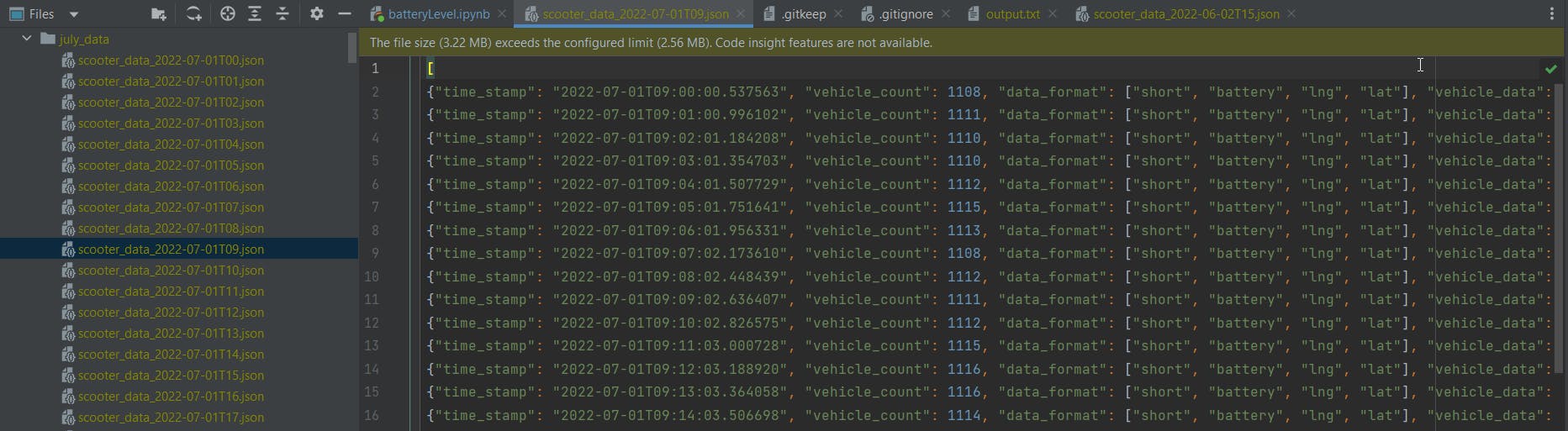
I collect the data of all Voi scooters around my city every minute by using the API provided by the Voi mobile app. The data includes each available scooter's id, battery level and location. I modify it into a JSON list. Then I save the result to a JSON file every hour. Therefore the data I have looks something like this:
Importing the data and plotting the graph
All data files are in the same folder, so I generate a list of all file paths inside the folder and sort them in ascending order. Then I sanitise the data by trying to parse it using Python's try-catch. If the data file is correct, Python would not catch any error, so if Python caught an error, I know I have to fix the data file. Once that's done, I read all the files in ascending order and stored the time stamp and vehicle count in two separate numpy arrays. I then plot it using matplotlib. The graph looks something like this:
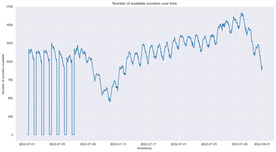
We can observe:
- Before 7/7, the scooter count always goes to zero at the end of the day. Because scooters are disabled at night, after that, Voi decided that scooters would be available 24/7, therefore the scooter counts never dropped to zero again.
- Near 12/7, the scooter count dropped to very low, that is just after the change, so maybe Voi did some changes in its workforce so that fewer workers are replacing batteries on scooters, or they are doing some checking on scooters so a lot is brought back for checking. Either way, the scooter count increased and returned to normal.
- After 30/7, the number of available scooters seems to plummet, I suspect that is because of the Commonwealth games.
Finding the set of all available scooters
Then I run through all files, running the set union function from Python, to find the set of all scooters available throughout July. I do that by the list of all available scooters at each time stamp to a set, and take the union of the set of all scooters registered. So in the end, the union of all sets is the total amount of available scooters.
After running that code, I found out there were 2544 scooters of unique id that were available at a point in July.
Get all dates list
What I want is a gigantic pandas table with scooter ids as columns, and time stamps as rows. I already know the ids, so I have to find the time stamps, I do so by iterating through all the data items and adding the time stamps to a list.
Fill all the tables
I run the code to fill all the tables, it does this by iterating through all the data files, in each individual data item, and adding them to the corresponding pandas table. This code is extremely slow because we have 44499 data of individual time stamps. And in each data, there are 1000 scooters, and for each scooter, we are storing their latitude, longitude and battery level, so we are adding 44499 1000 3 items to tables, which is over one hundred million. The code wasn't able to finish in 2 hours, therefore I had to stop it, and continue the code from where I left off the other day.
Plotting individual scooters
Some scooters are more active, like
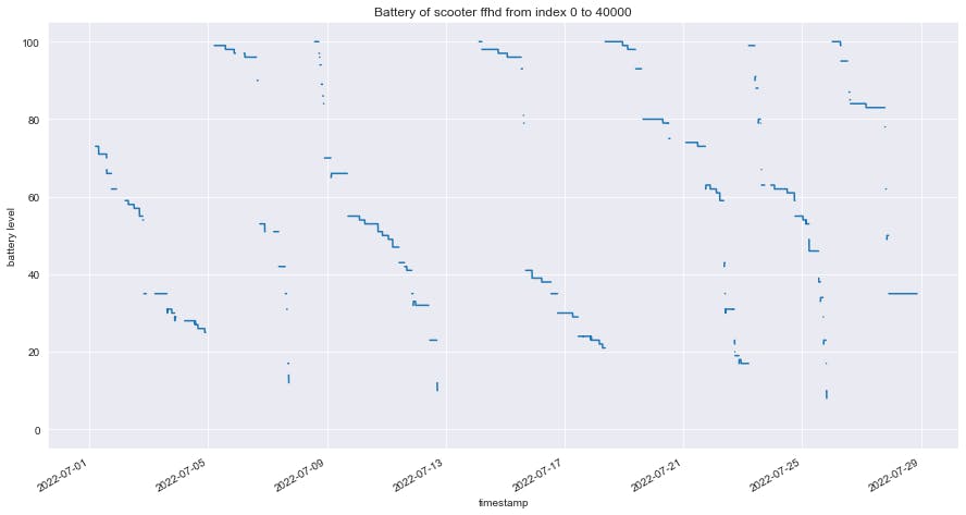
Some are decommissioned for some time, maybe for fixing, or just recycling scooters.
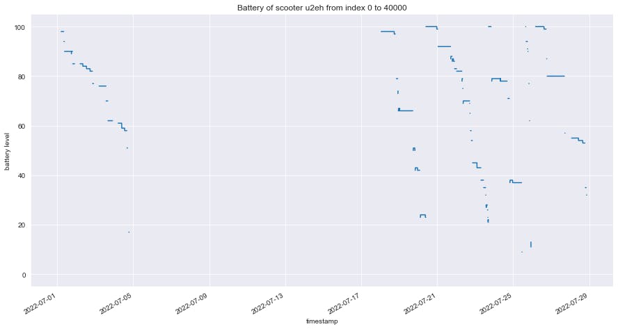
But keep in mind that we only know the id of the scooter, the same scooter could have its id switched, we don't know what the id means.
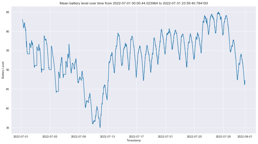
Plotting the mean battery count
now I wish to plot the mean scooter battery count. I do so by first dropping columns that were all null values. then I use the method of forwarding filling to fill in null values. Then at last I plot the graph using the plot function and the mean function with axis = 1. there are null values in my code reasons: when a scooter is rented, it is no longer available, so the value becomes null. when the scooter is called back for fixing or other purposes, it is not available. Before scooters are available all day, at night, all scooters are not available.
Plotting location heatmap
Then I generate the heatmaps using seaborn and matplotlib, I generate one for each hour, then piece them together as a gif file. The negative of having it as a gif file is that a gif file generally has a bigger file size as it compresses images individually, while mp4 is capable of storing the change between images, hence if the images in the video are similar, a lot of storage space can be saved. I convert the gif to mp4 using the answer suggested by this StackOverflow answer by using moviepy. and the result is as below.
Summary and what's next
There are a lot of interesting observations that can be made using these data. But for the length of this blog, I am just going to show the data collected and fewer observations. Again if you are interested in how the data was collected, you can check out Where's my Voi scooter series.
I think there are many conclusions to be drawn, such as where will scooters be concentrated at what time, and around what time most scooters are available.